
Visualising Data
Learning Objectives
- Understand the grammar and idioms of data visualisation.
- Identify resources to undertake data visualisation tasks.
- Understand the process of data presentation that facilitate decision-making.
- Appreciate current and future challenges, limitations, and opportunities in data visualisation.
- Reflect on personal development within the module.
- Use industry-leading tools like python and R for visualisations
Formative Activities
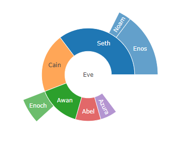
Throughout the module, we were tasked with weekly formative activities. These activities weren’t graded, but they acted as evidence for the reflective discussion assignment. In these activities we conducted analysis of articles/websites, and created visualisations using Python/R. For example, below is an image of a sunburst chart, show the hierarchy of parents/children. Sunburst Charts are a useful way of clustering information together to show relationships in data.
My Formative activity tasks can be accessed here
Programming Exercise
For our first assessment of the module, we were tasked with a programming exercise with R-Studio. We learned to use GGPlot and Plotly modules to create my graphs. The data used was Marketing Management Analytics (MMA) provided by The Portugese Banking Institution. Below is some snapshots of the graphs I created, and you can access my assignment report here, along with my R-Studio File.

